Ah… there’s no greater feeling than unveiling a huge project that you’ve been working on for months and yesterday the Creative team did just that by helping launch one of their client’s new branding projects.
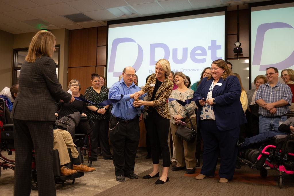
Presenting Duet, a developmental disabilities service provider.
Duet is a local Omaha non-profit formally known as ENCOR. They are a developmental disability service provider and were the nation’s first comprehensive provider of community-based services starting in 1968. The organization looked to us for a fresh look and a new name to fit the values they hold today.
The Challenges
- As time went on, the original name established in 1968, ENCOR, grew to have no meaning behind it. This was troublesome for the organization as they hold their values near and dear. This meant it did not convey the organization’s message.
- ENCOR is not an English word, the constant question was, “What does ENCOR mean?”
- This name was often mispronounced or misspelled.
Composing A Name
It’s common for non-profit organizations like ENCOR to use acronyms. That is why we wanted to use a name that was an actual word but could double as an acronym. It was determined that the new name had to embody these qualities:
- A focus on partnership, development, empowerment, and community
- Reflect that we help those we serve to find their voice
The new name had to be easy to pronounce, tie into the “voice” theme, be an acronym and a word, and tie into company values.
It had to show partnership by tying into how we work together with those we serve. It had to have a sense of community and represent that we work hand in hand with the people we serve. It had to be innovative with a modern name that conveys that we are constantly improving and utilizing new industry techniques to accomplish goals. And lastly, it had to be empowering to convey the idea that we help to give those we serve a voice.
We finally landed on Duet.
What Duet represents as a word…
The word duet symbolizes the partnership between staff members and the people they support. It also represents the ‘voice’ Duet helps the people it serves to find.
What Duet represents as an acronym…
Duet as an acronym is composed of the brand’s four values, “develop unite empower together.”
We’re in this TOGETHER, to DEVELOP their life skills, EMPOWER them in day-to-day lives, and finally UNITE within the community.
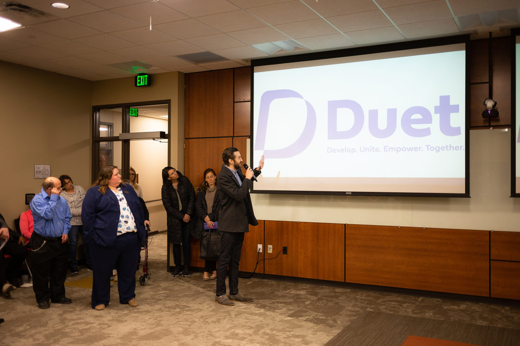
The Logo
The next challenge was the logo. We wanted to make a recognizable mark that incorporates what the name means to the organization without being too literal. We also wanted to use the letter “ D” and tie in the voice theme.
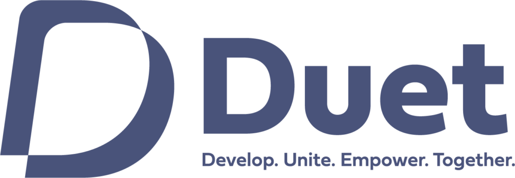
The logo mark which looks like the letter ‘D’ is actually two overlapping speech bubbles in action.
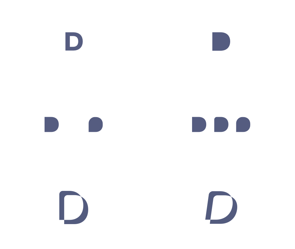
The Branding
The branding references inclusivity. We are different shapes but if we come together, we can make one big picture. Each shape has a pair, again, representing the relationship of the service provider and the people they serve.
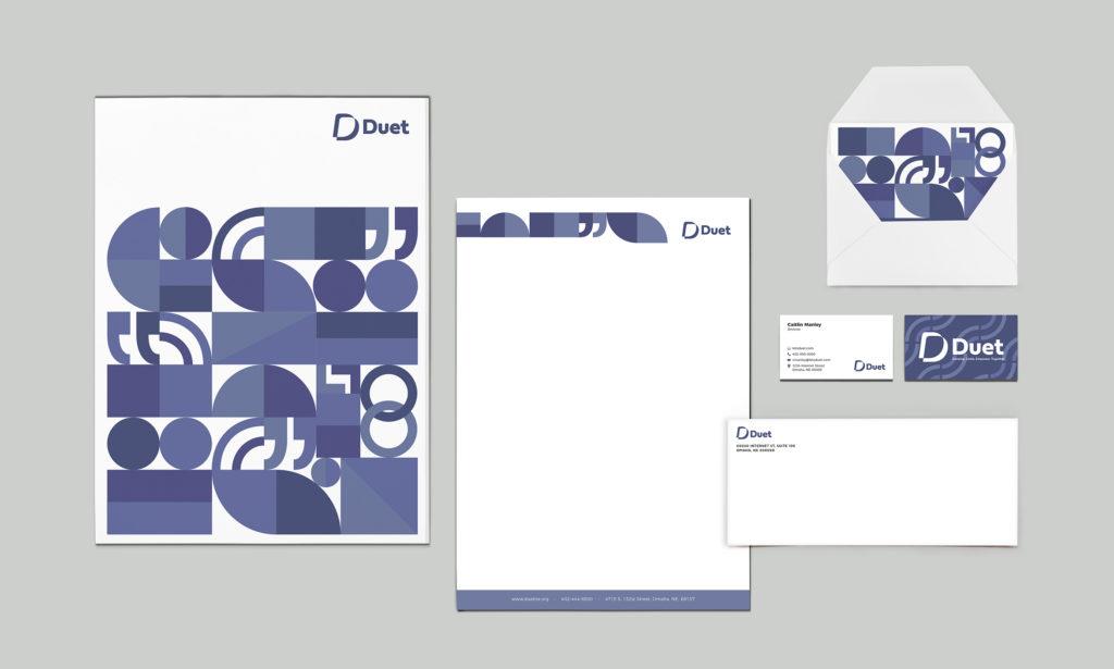
You can learn about Duet and all that they do on their website, duetne.org and let us know what you think about our recent project in the comment below!
Verdant Creative is a design and marketing agency focusing on branding, websites, marketing, and SEO. Contact us today for a free consultation.
