Smartphones have made mobile web browsing a way of everyday life. With information, shopping, and communication literally at our fingertips, businesses have had to make a drastic shift to responsive websites. Up until mobilegeddon, mobile and tablet design was rare. A site here or there had a responsive design but most did not. It wasn’t until a couple of years ago that responsive design became the norm.
Desktop vs Mobile Usage Statistics
Here are some interesting stats from Techjury
- Over the course of one-year, mobile users share increased with over 10%
- Millennials spent 3 hours and 45 minutes browsing on their mobile devices in 2019
- There are over 4 billion unique mobile internet users as of October 2019
- 51% of the time spent online in the US is on mobile devices
- Mobile market share worldwide is 52.1% compared to a desktop market share of 44.2%.
- 40% of people search only on a smartphone
- More than half of all video views come from mobile devices
- Phone-based CPCs cost 24% less than desktop and have a 40% higher CTR
- Mobile apps have higher engagement rates than mobile-optimized websites or desktop web viewing
The importance of mobile website design
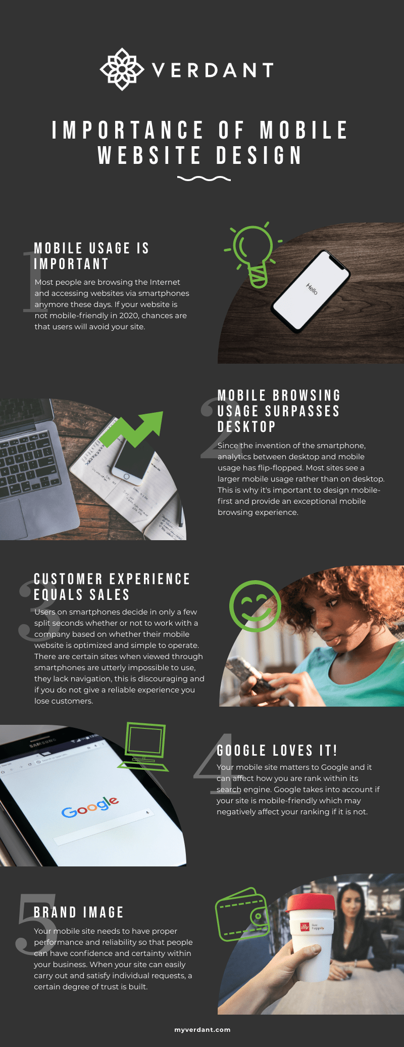
Mobile usage is important
Over the last couple of years, web designers have re-wired their brains to start designing mobile-first. Why? As discussed above, mobile usage has surpassed desktop usage. Start with a solid mobile design then expand to tablet and desktop.
Mobile browsing usage surpasses desktop
The desktop verse mobile usage statistics have flip-flopped over the years. Overall, over 50% of people will browse your site from their smartphone.
For some industries, this may not be the case. We suggest doing some case studies and create personas to help determine your audiences behaviors.
Customer experience equals sales
Due to the size of your smartphone screen, a website can’t have the same layout or act the same way it would on a computer desktop.
If a user comes to your website and it’s difficult to navigate, cluttered, or just simply not optimized for mobile browsing, a customer will become frustrated and probably exit the site. (raise your hand if you’ve done that!) Keep simplicity and ease of access in mind.
An awesome mobile website considers the following:
- Legible, larger text sizes
- Content that fits the page
- Easy of navigation
- Large touch-friendly buttons and navigation
- Fast page loading speed
Google loves it!
Did you know search engines like Google take into account whether or not your site is responsive? This can affect your SEO rankings. If Google considers your mobile website “unfriendly”, expect a possible penalty. This penalty, called an intrusive interstitial, can result in a lower search ranking on Google.
Brand Image
People associate professional looking things with value and quality. This point coincides with branding. Keeping to consistent branding and message instills trust within your customers and builds their confidence in your business. This means that those same people are more than likely to also be returning customers. If your mobile website is sleek, clean, and user-friendly, your users will more than likely have a positive experience
Is your website mobile friendly?
- Does your site load within three seconds?
- Is your content easy to read?
- How easy is it to navigate your site?
- Would you spend time on your website if it was not your own?
If you answered no to any of these questions, you may need to re-evaluate your website design. Contact Verdant Creative today for a free website audit and discover the potential your website holds.
