Verdant's Creative Partner
316 Strategy Group
We grow businesses.
Branding and Identity
As a small business owner, your brand is how the world sees you.
Do you want potential customers to think you’re sloppy or polished? Boring or creative? When you create a brand style guide, you get to choose. A style guide defines every aspect of how you present your company to the public.
As your business grows, the number of employees creating branded content will also grow. You might have different individuals managing your website, social media channels, and print marketing. Maybe you even outsource certain projects to freelancers.
Brand guidelines will help everyone get on the same page so you don’t end up confusing customers with disjointed visual and written messaging. Customers love consistency, and giving them what they want will help you earn their trust and loyalty.


What Does a Brand Style Guide Look Like?
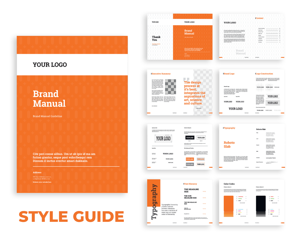
There’s no right or wrong way to design a style guide, as long as it includes a few basic elements. Brand guidelines come in many formats – your brand bible can be a PDF file, a physical book, a page on your website, or anything you dream up.
The most important thing is that it should be an accurate representation of your brand. The style guide provides written guidance for your team, but it also serves as a primary example of how the content your business produces should look and feel.
It should be simple and clear, but detailed enough that if you email it to a freelancer, they can return a deliverable that is unmistakably yours.
If it’s your first time creating brand guidelines, professional guidance can be well worth the investment. Having the support of an experienced designer or branding agency will ensure you end up with a high-quality, useful document.
The Essential Elements
A style guide should be specific to your company’s needs and goals. Every set of brand guidelines is unique, but there are a few elements that should always be included:
- Your brand story
- Logo guidelines
- Your company’s color palette
- Typography guidelines
- Your brand voice
- Image and illustration guidelines
Your Brand Story
Your brand story explains what your company is all about. This section typically covers your mission, vision, and core values.
You can think of your mission as your immediate goal and how you intend to achieve it. Your vision describes the future you hope to see. Your core values are your guiding principles – they inform every business decision you make.
Your customers want to know if you’re socially conscious, environmentally friendly, or if you have the most helpful customer service agents on the planet. Maybe it’s all of the above!
If your business has an interesting history, maybe you’ll decide to mention that in your brand story as well.
The brand story sets the tone for every single piece of visual and written content your employees produce, so be sure to give it the attention and thought it deserves.
The branding team at 316 Strategy Group will help you define your story in as few words as possible.
Logo Guidelines
Customers can recognize a great logo from a mile away, in under a second. On the other hand, a bad logo will often scare off potential clients, even if your product is top-notch. Inconsistent logo use is one more thing to avoid – it’s a sure way to create confusion.
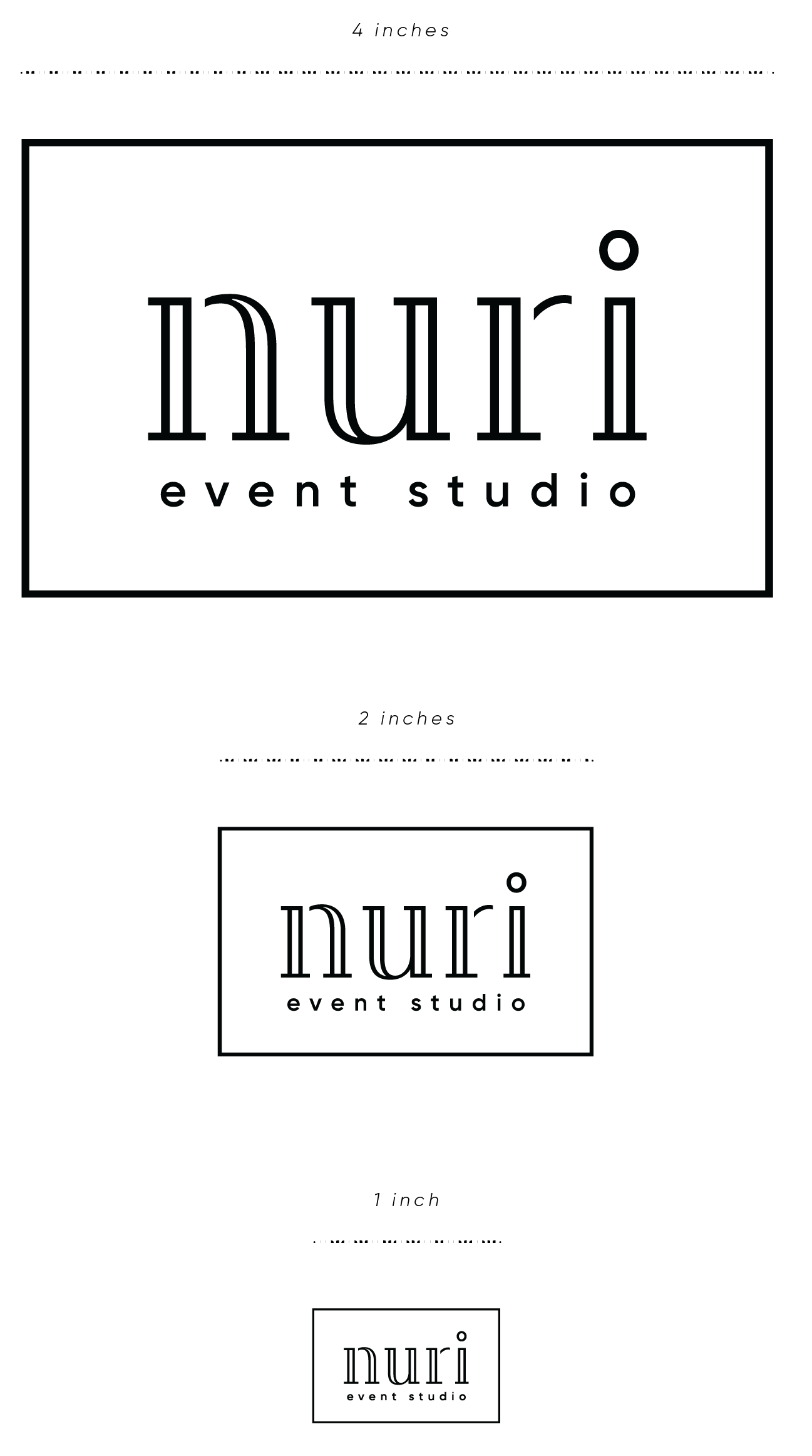
Logo guidelines paint a crystal clear picture of how your logo should and shouldn’t be used. In your style guide, you will definitely want to provide examples of proper logo use.
At a minimum, provide instructions and samples for color use, sizing, and spacing. You might want to make full-color and single-color logos available to choose from, and perhaps even explain when to use each one. Maybe your brand new website displays a stacked version of your logo, but your letterhead still uses a vertical logo format.
It can also be helpful to illustrate what not to do. Remind designers not to use outdated versions of your logo, change the aspect ratio, or modify the font. If you always want your logo to be straight, never angled, let your team know!
Some companies are even particular about which backgrounds their logos can or can’t be placed on. The level of detail is up to you.


Your Company's Color Palette
You probably put a lot of thought into choosing the perfect colors to represent your brand. Colors can have significant effects on the mind, body, and mood, an experience that is not lost on customers. In fact, there’s a good chance your color palette is what attracted some of your clients in the first place.
Think about it – have you ever been drawn in by that perfect shade of ocean blue on a beach hotel’s website? Or maybe you’ve wandered into a restaurant because of its warm, welcoming hues.
Even the slightest change in your brand colors can have your customers wondering if that’s really you, so designers need the tools to get each shade exactly right.
The color palette section of your style guide should display each brand color. It should also provide each color’s Pantone number for color matching, CMYK code for printing, and RGB and HEX codes for digital applications. Online tools make it easy to convert your color codes between formats.
It’s also common for companies to have a secondary color palette, in addition to the primary palette. The primary palette is used for most projects, but a set of complementary colors might be used on your website, social media channels, or for special events.
For your primary color palette, designers recommend choosing a light color for background use and a dark color for text. You can also add a neutral shade and a bright shade. With this combination, you’ll be prepared for almost any design challenge.
Typography Guidelines
Most communication happens through writing, so typography presents a huge opportunity to express yourself. Finding the right combination of fonts to capture the feel of your brand is an art.
For print and website headings, you can get away with bolder, more expressive options. The font you use for sentences and paragraphs should be subtle, to keep the attention on the words. Make sure any font you choose is readable.
Picking clean, easy-to-read fonts for your business is so important. Intricate fonts require extra effort, and you definitely don’t want to distract clients from what you’re trying to say. Or maybe the perfect font doesn’t exist yet. Some companies decide to create their own.
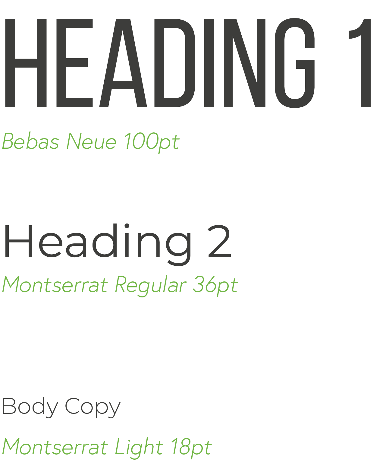
Your brand style guide should specify which fonts you use for which purposes. Headings, subheadings, and paragraphs will each have their own rules. Maybe your website looks different than your brochure.
You’ll want to list information such as the font name, size, and weight. Your employees also need to know if there are any special spacing requirements. This section is also a place to say if you like your text centered or aligned left or right.

Your Brand Voice
Think of your brand voice as what sets the mood of your company. What tone do you want to use with your customers when you write or speak? You should also think about what kind of language appeals to your target audience.
If you run a summer camp, friendly is an obvious choice. Or maybe you own a tech business with a sense of humor. A company’s personality can be casual or formal. Welcoming, professional, and sincere are words commonly used to describe brand voice.
You can write a few paragraphs about your brand voice, or you can keep this section short and sweet. Just make sure it’s easy for your team to understand.
This is one area where examples can be helpful. Look through past communication and identify what you like about it. Consider sharing a few sentences from your website or marketing materials that really capture the tone you’re aiming for.
You can also include a list of any words or phrases to avoid. Maybe “thinking outside the box” makes you cringe, and you are welcome to say so.
Image and Illustration Guidelines
Visuals can make or break a brand. Hundreds of millions of new images are uploaded to the internet every day, many to sell a product or service. Your brand’s visual content needs to stand out, or it will get lost in the mix.
As with all brand elements, consistency is key here. This section outlines how photos and illustrations should be used to represent your overall brand.
Your preferences can be conveyed in a variety of ways. Maybe there’s a style of photography you love, an emotion you want to capture, or even specific camera settings you want employees to use.
Color use is important, too. A company that grows fresh herbs might require at least one shade of green in every photo.
You can also cover lighting and subject preferences. Do you like natural or studio lighting? Are landscapes your thing, or should the focus be on smiling faces?
An inspiration board can help team members understand your vision. Collect photos that feel aligned with your brand and make a collage or add them to a shared folder.
Graphic designers will need to know if they should work with specific colors or shapes and if you like your shading and shadows a certain way. Do you want the illustrations they create for you to be whimsical or realistic?
The same details apply to data visualization. Most businesses will want to keep charts and graphs simple, using their primary color palette.
Again, examples are key. If there’s an infographic on your website that you just love, share it as inspiration for future projects.
Optional Elements
Before you finish your brand style guide, think about any unique situations your company might face. You can add sections accordingly.
Social media templates and guidelines can help you maintain consistency across multiple channels like Instagram & Facebook. If you produce audio or video content, some related information could be helpful. Believe it or not, scent marketing guidelines are a part of many retailers’ brand books.
Instead of following someone else’s format, adapt your style guide to meet your own needs.
The Evolution Of Your Style Guide
Your company is constantly adapting to change, and your style guide should too. After you publish your first set of brand guidelines, notice if there are any frequently asked questions. Keep a list of additions or edits that could make things clearer.
Revisit and revise your style guide annually to prevent it from becoming outdated and irrelevant. Older versions can serve as a fun record of your brand’s history.
Your Team Will Thank You
Developing a style guide takes time, but in the long run, it will save you hours. Instead of having long conversations about branding every day, you can attach your brand guidelines to an email and hit send.
A style guide is also a great way to ensure quality control as your brand grows and adds employees. You won’t have people making arbitrary design decisions because you’re not available to answer their questions.
Your team will appreciate your clear communication that helps them do their jobs more effectively. Best of all, you’ll end up with beautiful, consistent brand collateral that will delight your clients.
If you need help getting started, contact us to learn more about our branding services.
